While it’s not possible to change the CSS of the newsletters sent with MailPoet, you can add custom CSS styles to your website in order to modify the style of subscription forms, or custom pages like Unsubscribe and Manage Subscriptions.
For that, we recommend adding the custom CSS to the site’s “Additional CSS” .
For non –block-based themes, that would be under WordPress Admin > Appearance > Customize > Additional CSS. This CSS editor can apply CSS to any or all portions of your website.
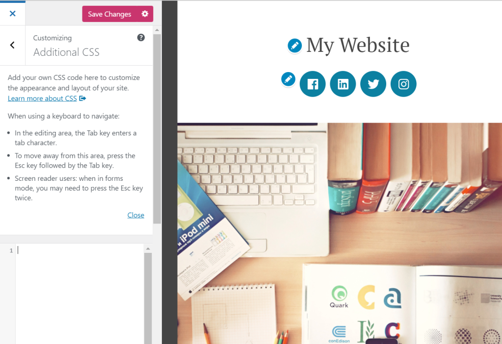
For block-based themes, using the Site Editor you should be able to add CSS by going to WordPress Admin > Appearance > Editor, selecting the “Styles” option in the left sidebar, clicking into the Site Preview, and then selecting the three dots at the top of the right sidebar and then selecting “Additional CSS”:

Please note this may be different with certain themes or page builders that don’t use the standard WordPress site editor.
Examples of CSS to edit MailPoet forms
- The pop-up form width is larger than the screen on mobile
- Editing the placement of the pop-up form on mobile
- Editing the pop-up close button
- Centering the Below Pages/Posts form
- Displaying pop-up form images on mobile
- Hiding “Please leave this field empty” label from the form
- Adding CSS classes to links in form checkbox labels
The pop-up form width is larger than the screen on mobile
The @media rule is used in media queries to apply different styles for different media types/devices. It usually refers to the device’s max and/or min-width as a condition to apply this rule.
Using this rule, we can specify a smaller width percentage for mobile devices:
@media (max-width: 500px) {
  #mp_form_popup1 {
    width: 90%;
    min-width: 90%;
  }
}
If it doesn’t work, try adding !important to it:
@media (max-width: 500px) {
  #mp_form_popup1 {
    width: 90% !important;
    min-width: 90% !important;
  }
}
Editing the placement of the pop-up form on mobile
The currently max-height for the pop-up form on mobile is 40%. You can change it (i.e., to 60%) by adding this CSS code:
@media (max-width: 500px) {
  #mp_form_popup1 {
    max-height: 60%;
  }
}
Note: the number in #mp_form_popup1 depends on the form ID and would need to be adjusted based on your form.
Editing the pop-up close button
Depending on your theme’s CSS, sometimes the close button for the pop-up form may not be displayed or can be displayed bigger or smaller than it should.
If the close button is not being displayed at all, you can try to fix it by adding this CSS:
.mailpoet_form_close_icon {
  padding: 0 !important;
}
If the problem is its size:
.mailpoet_form_close_icon {
  height: 20px;
  width: 20px;
}
Centering the Below Pages/Posts form
If you want to center a “Below pages” form on the page, you can use this CSS:
#mp_form_below_posts1 {
  width: 340px;
  margin: auto;
}
Note: the number in #mp_form_below_posts1 depends on the form ID and would need to be adjusted based on your form.
Displaying pop-up form images on mobile
Background and other images are removed from mobile device pop-up forms for responsiveness.
However, you can force it to be displayed by this CSS code:
@media screen and (max-width: 499px) {
  .mailpoet_form_image {
    display: block;
  }
}
Hiding the Please leave this field empty label from the form
The field itself is a honeypot to prevent bots, but depending on the theme, the label may be displayed.
Please add the following CSS to hide that:
.mailpoet_hp_email_label {
  display: none !important;
}
Adding CSS Classes to Links in Form Checkbox Labels
Starting with MailPoet 5.5.0, you can add CSS classes to links within custom checkbox labels in your subscription forms. This is useful when you want to style specific links differently — for example, a privacy policy or terms and conditions link in a consent checkbox.
To use this feature:
- Go to MailPoet > Forms and edit your form.
- Select or add a custom checkbox field.
- In the checkbox label, add a link with a
classattribute. For example:I agree to the <a href="/privacy-policy" class="privacy-link">Privacy Policy</a>
- Add the corresponding CSS to your site’s Additional CSS (see the instructions at the top of this article) or to the form’s Custom CSS panel in the form editor:
.privacy-link {
  font-weight: bold;
  text-decoration: underline;
}
Previously, the class attribute was removed from links in form content for security reasons. It is now allowed, along with href, title, target, and rel attributes.
Note: This applies to links within MailPoet form fields that support HTML content, such as custom checkbox labels. It does not affect links in newsletter emails, which have their own rendering rules.